Controls
Overview
Controls are the main building block for your forms for getting user data, displaying information, and enforcing security. This section will cover how each of these controls work, as well as the properties that can be used in your rules. For guide on the form designer interface, see Form Designer.
Common Properties
The following are some common properties found in most control types:
Note
For the following sections in this document, when a property is in this format, that means it can be modified by a rule.
The rules’ format for a control property is ControlName.property.
Property |
Description |
Datatype |
|---|---|---|
Name |
System name for a control. Must be unique and without space. Used for rules, actions, and other references. The name is automatically changed when the label is updated in the form designer. |
String |
|
Display name for a control. Can include markup tags for formatting. |
String |
Help Text |
Creates a |
String |
New Line |
Forces the control to position itself as the beginning of a new line. |
String |
Borderless |
Removes outlines from the control. |
Boolean |
Hidden Label |
Hides the label above the control. |
Boolean |
|
When |
boolean |
|
When |
boolean |
|
Causes the form to block submission if the user didn’t enter data in this control. |
boolean |
|
A read-only value containing the control’s field type. Rules only. |
String |

Input
These controls accept input from the users filling out the form.
TextBox
This control accepts a small amount of text. This control is useful for when the user must submit raw text whether it is a single value, word, or phrase. Also allows for text to be masked for privacy. This field also allows for a default value by entering text into the field in the form designer. For large amounts of text, see Text Area.
A Text Box control has the following additional properties:
Designer
Placeholder: Text entered here will show as gray in the text box in order to give the user a hint about what they should enter.
Pattern: Uses JavaScript regular expressions to require a certain format for the user’s input.
Select Pattern: Some patterns have been provided for you. These patterns are email, SSN, and ZIP code
Max Characters: Takes a numerical value as the character limit for the user’s entry.
Masked: When checked, hides the user’s input. Useful for hiding passwords or other sensitive information.
Rules
value: The text in the field. Accepts String values.
Text Area
This control records text from the user, similar to a text box. However, this control supports multiple lines of texts, such as with paragraphs. This field also allows for a default value by entering text into the field in the form designer.
The Text Area control has the following additional properties:
Designer
Placeholder: Text entered here will show as gray in the text area, giving the user a hint about what should be entered.
Max Characters: Takes a numerical value as the character limit for the user’s entry.
Visible Lines: Takes a numerical value which determines how many lines can be visible at a time. This means larger values cause the Text Area control to take more vertical space.
Rules
value: The text in the field. Accepts String values.
Numeric
This control only allows numerical values, plus signs, and subtraction signs to be entered. This control also features an upward and downward arrow which allow the user to click to increment or decrement a value. Only integer values should be entered in these controls.
The numeric control has the following unique properties:
Designer
Min Value: The smallest amount allowed in the field.
Max Value: The largest amount allowed in the field.
Rules
value: The numeric value of the field.
Currency
This control formats an input number as a monetary value, retaining two decimal points. Extra decimal places will be truncated.
The currency control has the following unique property:
Designer
Min Value: The smallest amount allowed in the field.
Max Value: The largest amount allowed in the field.
Rules
value: represents the value of the field as a number.
DateTime
DateTime controls allow users to enter date and time values. They replace Date controls from previous versions. The date format will appear according to the locale settings in the viewer’s browser.
There are three variants: Date, Time, and DateTime. Dates only allow calendar days. Times allow only clock times. DateTime combines the other two.
The DateTime has the following unique properties:
Designer
Input Type: A dropdown which selects the format variant of the control.
Rules
inputType: A read-only string containing the variant of the control. Possible values are “date”, “time”, and “datetime-local”.value: Varies based on the variant used:
For a Date the format is
yyyy-MM-dd.For a Time control the format is
HH:mm, where HH is an hour from 00 to 23 and mm is the minutes from 0 to 60.For DateTime, the value combines
DateandTimein the formatyyyy-MM-dd'T'HH:mm.DateTime.value = "2024-12-29T15:30";would display in a form in the US as “12/29/2024 3:30 PM”.
While it’s possible to use strings to set the date and time, they can also be set using JavaScript’s built-in Date() object.
This control can also be set with the Date object’s toString() and toISOString() methods.
// Setting the date to today
DateTimeControl.value = Date.now();

//alternate methods that get the same result
DateTimeControl.value = new Date();
DateTimeControl.value = new Date().toString();
DateTimeControl.value = new Date().toISOString();
Date objects allow for easy manipulation of dates and times:
/* Set the date to one week from today */
var d = new Date();
d.setDate(d.getDate() + 7); // adds 7 days to the current date
DateTimeControl.value = d;

/* move the time forward by 3 hours and 25 minutes */
var d = new Date();
d.setHours(d.getHours() + 3); // adds 3 hours to the current time
d.setMinutes(d.getMinutes() + 25); // adds 25 minutes to the current time
DateTimeControl.value = d;
Dropdown
This control gives the user a set of options to choose one from. Clicking the downward arrow displays the list of options. Typing a few letters brings the selection to the first word beginning with those letters.
The dropdown control has the following unique properties:
Designer
Options: Each line represents a selectable option. The value (left of the “=”) is recorded in the system while the option (right of the “=”) is displayed to form users and viewers.
Rules
value: holds the current dropdown’s selected value. Using a rule to assign a value that exists in the options list will set the dropdown to that value. Setting the value to be""will clear the selection.options: This is the list of the available value choices for the dropdown. For assigning options with rules, options are assigned with JavaScript dictionary objects.
An example of adding multiple options at once:
//The code below gives an options list with "cat" and "dog"
Dropdown.options = {'cat':'cat', 'dog':'dog'};
An example of adding options one by one to a set. This can be useful if you are generating options from a database or using some other expression:
//initialize options variable
var options = {};

//populate option list with nine options
for(var i = 0; i < 9; i++){

    //expression
    options['Option' + i] = 'Option ' + i;
}

//put options into the control
Dropdown.options = options;
Checkbox
This control allows users to select multiple choices from a set of options.
Checkboxes have the following additional properties:
Designer
Options: Each line represents a selectable option. The value (left of the “=”) is recorded in the system while the option (right of the “=”) is displayed to form users and viewers.
Horizontal: Checking this option will align the items in rows instead of columns.
Rules
value: Represents the currently selected values. This takes the form of a JSON in string notation. Any values found in the JSON String will have the corresponding option checked; an empty JSON String or one that has values not in the options list will have nothing checked.options: This is the list of the available value choices for the dropdown. Options are assigned with JavaScript dictionary objects, similar to dropdown controls.inline: Allows options to align themselves horizontally. It can be set eithertrueorfalse.
An example of setting Checkbox options with a rule.
//CheckBox Options: Value 1=Option 1, Value 2=Option 2, Value 3=Option 3
//this line will leave only the Option 1 checked
Checkbox1.value = JSON.stringify(['Value 1']);

//This will check "Option 1" and "Option 3"
Checkbox1.value = JSON.stringify(['Value 1', 'Value 3']);

//This will leave nothing checked
Checkbox1.value = JSON.stringify([]);
Radio
Allows the user to pick an option from a set. Options are laid out in a list with a circle to the left. Selecting a circle deselects the previously clicked option in the control. This is functionally the same as a dropdown.
This control has the following additional properties:
Designer
Options: This is the list of the available value choices for the dropdown. The value (left of the “=”) is recorded in the system while the option (right of the “=”) is displayed to form users and viewers.
Horizontal: Checking this option will align the items in rows instead of columns.
Rules
value: Holds the radio’s selected value. Using a rule to assign a value that exists in the options list will select that value. Setting the value to be""will clear the selection.options: This is the list of the available value choices for the Radio. Options are assigned with JavaScript dictionary objects, similar to dropdowns.inline: Allows options to align themselves horizontally. It can be set eithertrueorfalse.
Example rule to clear a selected option:
//removes radio selection
radio.value = "";
Note
The main difference between a radio and a dropdown is that users can not deselect a radio option without the use of the rule above.
Upload
This allows Users to upload files as attachments to the form using their machine’s file explorer. When clicking upload, the user’s file browser will appear so they may choose a file to upload. This can be repeated to add additional files.
Designer
Max Size: The largest file size allowed in Kilobytes.
File Preview: When checked, the control will show a thumbnail of uploaded image files.
Select Preview: Appears when file preview is selected. This affects the sizing of upload previews. * Horizontal Thumbnail: Images will appear as small thumbnails, and uploads will be organized in columns. If a new column would make the list wider than the Upload control’s width, it will start a new row. * Vertical Thumbnail: Images will appear as small thumbnails, and uploads will be organized as a single column. * Full Size: The preview will be the full image size. * Stretch to Fit: The image will be scaled to fit the width of the upload control.
Rules
files: This is a JSON object containing the uploaded files. It can be stringified (JSON.stringify(Upload.files)) to show all files and their metadata. Individual files can be accessed by their index (for example,Upload.files[0]for the first file).Files objects have the following properties:
id: A unique identifier for the file, which can be used to reference it in rules or actions.name: The name of the file.size: The size of the file in bytes.
remove(int i), clear(int i): These functions remove the file at indexifrom the list of uploaded files. The index starts at 0, soremove(0)will remove the first file.remove(String id), clear(String id): These functions remove the file with the specified unique ID from the list of uploaded files.
Note
If the files object is not stringified, assigning the value to a text box will only show the first file object.
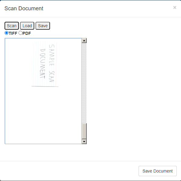
Scan
This control is a clickable button which brings up the Scan Interface. From there you can scan in a new document using a connected scanner. Scanning additional documents will append them to documents in the preview. When using a connected scanner, it will use the scanning interface from your scanner, so the options it presents may vary. A preview of the scanned document will show in the center of the scan interface. Once a document has been scanned, the user can save the document to their computer using the Save button. Clicking Save Document at the bottom right will attach it to the form. There is a load function as well where users can select a file from their local machine, however this will only take images from the selected documents. If you wish to get whole documents from a system, please use the upload control.
After saving the document to the form, the name of the document will appear under the scanner control to show what document was attached.
Note
Recent versions of Chrome may prompt for a “Local Network Access” permission the first time a form with a Scan control is opened, since scanning talks to a local scanner service running on the user’s machine. Users must allow this permission for the Scan control to reach the scanner.
Rules
files: This is a JSON object containing the uploaded files. It can be stringified (JSON.stringify(Upload.files)) to show all files and their metadata. Individual files can be accessed by their index (for example,Upload.files[0]for the first file).Files objects have the following properties:
id: A unique identifier for the file, which can be used to reference it in rules or actions.name: The name of the file.size: The size of the file in bytes.
remove(int i), clear(int i): These functions remove the file at indexifrom the list of uploaded files. The index starts at 0, soremove(0)will remove the first file.remove(String id), clear(String id): These functions remove the file with the specified unique ID from the list of uploaded files.
Note
If the files object is not stringified, assigning the value to a text box will only show the first file object.
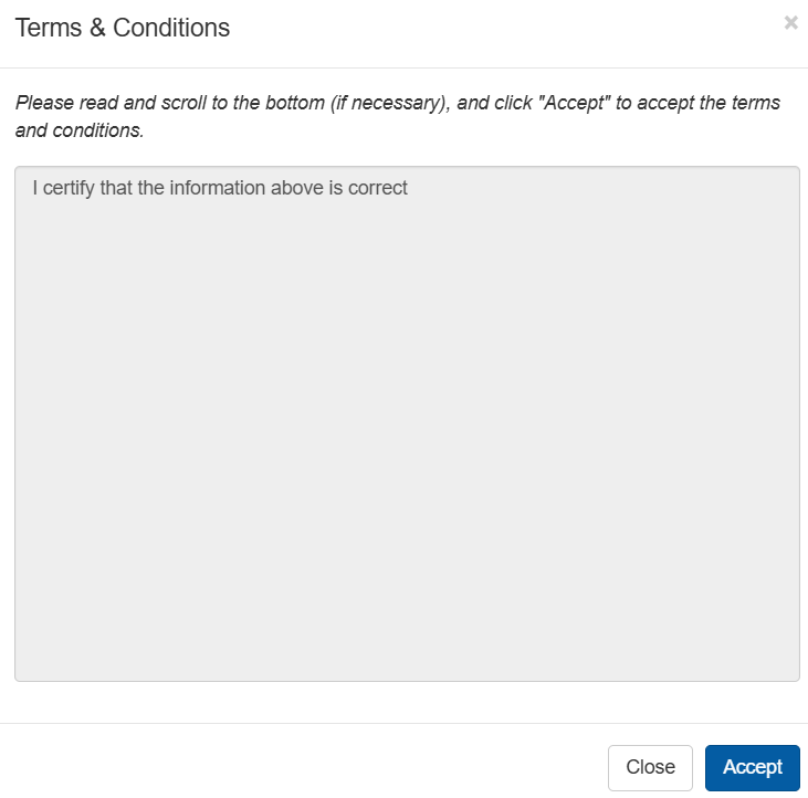
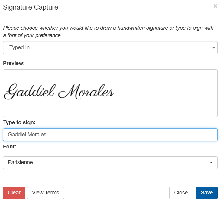
Signature
Signature fields prompt viewers for a signature in agreement with the form contents. Form designers can add terms which will be displayed before the user is able to provide a signature. Users may sign by using One-Click Sign, typing a signature, or drawing signature with a mouse or touchscreen. When typing a signature, users may select a preferred font. One-Click sign uses the font in the user’s account, though may also select a font using the dropdown.
The signature will be sent as an attached image file when the form is sent with an email or submitted. Additionally the form XML will capture metadata such as the user’s IP, signature time, and their user data if logged in, including email, username, first name, and last name.
Note
To record the signature geolocation in the form XML, a GeoLite2 key must be set in the system config.
Additionally, if LiveForms is accessed from localhost, the IP and geolocation will not be recorded in the XML.
The metadata that appears in the signature footer can be configured in the form options.
When used in a flow, completed signatures will be locked on subsequent flow steps. If a flow is returned to the original stage where a signature was completed, such as with a rejection action, the signature will unlock.
This control has the following unique properties:
Designer
Terms & Conditions: Allows the designer to add signature terms which the form users must review.
Lock on Submit: When checked, the signature becomes locked (read-only) once it has been completed - this is what drives the “completed signatures will be locked on subsequent flow steps” behavior described above.
Rules
value: The name of the signature file, which will be attached to the form as a PNG image file.readOnly: Read-only. Returnstrueif the signature is currently locked (see Lock on Submit above),falseotherwise.meta: JSON object containing the captured signature metadata. It may be stringified (JSON.stringify(Signature.meta)), or its fields can be accessed (for example:Signature.meta.firstName). The metadata is cleared if a rule clears the signature.These are the available metadata fields:
username: The username of the user signing the control.email: The email of the user signing the control.firstName: The first name of the user signing the control.lastName: The last name of the user signing the control.dateTime: The date and time of the signature.ipAddress: The IP address of the user signing the control.signStep: The flow step when the signature was captured.
Topaz GemView
With the Topaz option enabled in the form options, forms will allow Topaz pads to capture signatures. If no Topaz pad is detected and Topaz is the only selected signature option, the form will fall back to a hand drawn signature.
If a Topaz Signature Pad is connected, a pop-up will appear where the user can see the signature they are drawing, similar to hand drawn signatures.
When a GemView pad is detected, a button will appear at the lower left to push the form to the GemView display, and the GemView will open an idle screen. Clicking the button opens a new tab on the original display, which allows the operator to view what the GemView user is doing. Either the operator can return the form using the button at the top right, or the GemView user can return it using the button at the bottom left. When the GemView user begins signing, a capture window will appear which is only visible to the GemView user. The operator will see the video stream darken and a message that a signature is in progress.
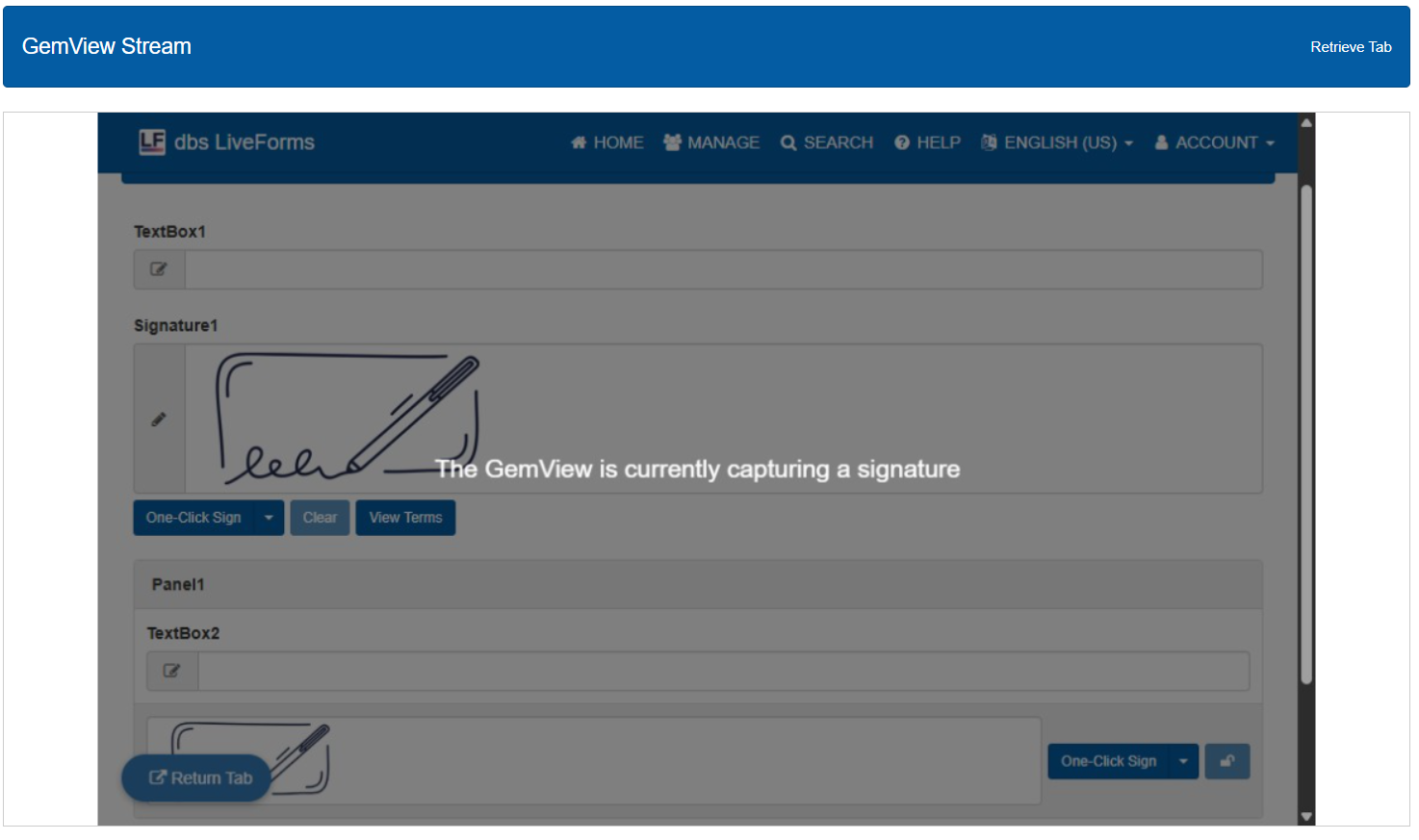
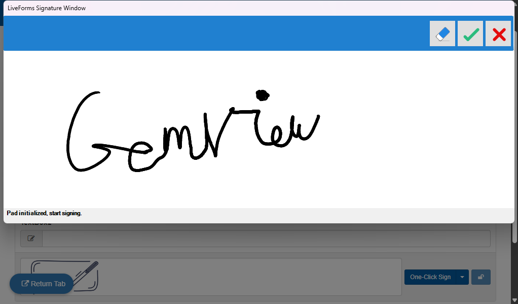
If the operator clicks on a signature with the form on the main display, they will get an interface for a hand drawn signature.
Topaz signatures will attach a unique signature file (.sig) to the form data.
Layout
These controls are primarily used for organizing control groups.
Note
A Panel, Repeat, or Tab cannot be dragged inside another Panel, Repeat, or Tab - containers do not nest.
Panel
This control acts as a container for other controls. Its security properties give it ability to selectively show form content.
If any users or roles are specified, any other user is excluded from viewing the Panel.
Existing user and group names in the system will be suggested as you type.
Unchecking the enabled property disables all the page’s contained controls.
This control has the following unique properties:
Designer
Users: A username put here allows the specified user to view the control. Multiple users can be added as a comma separated list.
Roles: Any member of a role name put here will be able to view the Control and its contents. Multiple roles can be added as a comma separated list.
Collapsible: Allows a user to shrink the panel by clicking the label bar.
Collapsed: If checked, the panel will be collapsed when opening the form.
Lock on Sign: Adds a signature to the panel. This will disable all controls inside it, preventing any changes to the data.
Rules
collapsed: This value corresponds to the panel’s collapsed state.truewill collapse the panel, whilefalsewill open it.readOnly: Read-only. When the panel’s Lock on Sign is enabled, returnstrueif the panel is currently locked (the flow has moved past the step where its signature was captured),falseotherwise.
Repeat
This control works very similar to a Panel, however duplicates of the Repeat, including all controls inside, can be made by clicking the green plus sign at the top right of the control. If there are multiple panels, clicking the minus sign removes a panel and its contents. If any users or roles are specified, any other user is excluded from viewing the Repeat. Existing user and group names in the system will be suggested as you type.
Note
Upload, Scan, Signature, and Barcode controls cannot be placed inside a Repeat.
This control has the following properties:
Designer
Users: A username put here allows the specified user to view the control. Multiple users can be added as a comma separated list.
Roles: Any member of a role name put here will be able to view the Control and its contents. Multiple roles can be added as a comma separated list.
Min: The user will not be able to delete panels so that there are less than this amount. The form will start with this many panels when opened.
Max: The user will not be able to add more than this many repeat panels.
Rules
To represent the instanced field in a Repeat, the contained controls use a values array, which starts from index 0.
Below are some example of rules interacting with controls contained in repeats:
Note
ControlName.value references the first value instanced on the repeat.
/*setting a specific value in a repeat can be done in a few ways.
*
* In this example, the form is filled out by a student whose full name was entered earlier.
* There is a repeat for family information which has a TextBox expecting the full name of the family member.
* We can autofill the students full name using the first and last name they entered earlier.
*/

var fullname = firstname.value + " " + lastname.value;

/**
* Method 1: Using the values array
*/
var names = name.values;
names[0] = fullname;
name.values = names;

/**
* Method 2: using `_set`
*
* Note that set does not register an update event to the control values,
* so we need to set the values to themselves.
*
* Usage: _set(ControlName, value, arrayIdx)
*/

_set(name,fullname,0);
name.values = name.values; //triggers a value update on the form.

/**
* Method 3 (Special Case): first value
*
* Since these examples are modifying the first value (item index 0),
* we are also able to use ControlName.value.
* However, we would not be able to modify the second or more value in this way
* (items index 1+).
*/

name.value = fullname;
/**
* In this case, a repeat control contains a Numeric field named "Numeric".
* This code gets the sum of all the Numeric field's values in the repeat.
*/

var sum = 0;

//for each numeric value from 0 to the end of the array
for(var i = 0; i < Numeric.values.length; i++){
    //add value to sum
    sum = sum + Numeric.values[i];
}

//store sum into a control named "Result" on the form
Result.value = sum;
Tab
Tabs allow compact organization of controls. Each individual tab, also called a page, within the control acts similar to a panel. On submission, the tab pages are converted to panels so all the data is visible. If any users or roles are specified, any other user is excluded from viewing the Tab. Existing user and group names in the system will be suggested as you type.
Tabs can be re-ordered by dragging them in the tab container.
The tab control has the following unique properties:
Designer
Users: A username put here allows the specified user to view the control. Multiple users can be added as a comma separated list.
Roles: Any member of a role name put here will be able to view the Control and its contents. Multiple roles can be added as a comma separated list.
Tabs: The number of contained tab panels.
Page Break: When generating the PDF, a page break is inserted between each tab page.
New Line: In addition to the New Line behavior for the controls, when generating the PDF, a page break is inserted between each tab page.
Nav Buttons: Adds a Previous and Next button to the bottom of the tab container, which offer another way to navigate between tabs.
Tab pages also have their own Per Page Properties.
You can choose which tab’s properties to edit by choosing the corresponding tab number in the dropdown.
To change their properties with rules, use the Tab name.
Unchecking the enabled property disables all the page’s contained controls.
Rules
page: An integer representing the currently open page. Setting this to a number will open the page at that index.
Interactive
These controls are for utility, adding tools and features other than capturing user data.
Link
Stores a link given in the form designer and opens a new tab using that link when clicked.
This control has the following additional properties:
Designer
URL: Holds the link that the user will open.
Rules
href: Holds the link that the user will open.
Trigger
This control is a clickable button which is used to activate rules. Clicking on this control is detectable with a change event or a click event. See Rules for more on making rules.
Payment
This control allows the user to perform a payment in the form. Upon clicking, users can be taken to a pop-out window to a site such as PayPal to handle payment processing. The Order ID for this payment will be automatically generated by LiveForms.
There are currently four services available to connect with the payment control: Financial Payments by Herring Bank, PayPal, Authorize.net, and Transact. Each service has separate Test and Production options in the Service dropdown, so you can develop and verify a form against a sandbox account before switching it to take real payments. It is advised that you test using the developer version of these services before giving access to your users. Put identifying information in the merchant ID field, depending on the service you are using.
Merchant ID Examples:
Authorize.net:
1zX2h3kP:9pQ7wY2zT4(API Login ID and Transaction Key, separated by a colon)Financial Payments: 1234
PayPal: sample@example.com
Transact: 123456
Note
PayPal offers a free testing environment which you can find at developer.paypal.com.
This control has the following additional properties:
Designer
Service: Used to specify which service, and whether the Test or Production endpoint of that service, will execute the payment process.
Merchant ID: ID of the party receiving payment. This will be a business account registered with the payment service.
Transaction: Used for the Financial Payments service by Herring Bank. This can be used to organize and track payments.
Items: A list of items to be charged. Each item is a pair of name and value, such as “Fee=35.00”. Some payment services do not support itemized lists. In these cases, the sum of the items will be used as the total amount charged to the user.
Rules
merchantId: ID of the party receiving payment. This will be a business account registered with the payment service.orderId: The order ID for this payment, automatically generated by LiveForms. Can be read, or set by a rule before the user opens the payment window.amount: A single dollar amount the user will be charged. Setting this overwrites the items list with a single item named fee.items: A map listing the charges as a pair of names and values.
//The code below sets an item list and the associated costs.
Payment1.items = {'Fee':'35.00', 'Tax':'3.50'};

//This code block sets a single amount to be charged.
Payment1.amount = 38.50; //equivalent to Payment1.items = {'Fee':'38.50'};
Financial Payments
When configuring an account with Financial Payments, the LiveForms callback URL is: https://<server>/liveforms/web/fpPaymentGateway where <server> is the server name where LiveForms is hosted. The transaction field in the control can be used to identify the payment in the Herring Bank account. If the field is left blank, the transaction type will show up as “Fee”. The testing and production URL used for Financial Payments can be configured in the system or domain settings.
Captcha
The Captcha control can be placed on a form in order to protect a form from automated form fillers. It simply requires a user to check the box before submitting the form. Users deemed as suspicious may have to perform additional captcha tests.
Note
Captcha controls require an admin to add a key in the system config.
This control has the following additional properties:
Designer
Center: Moves the captcha to the center of the control
Compact: Makes the captcha thinner, which can be useful for mobile devices.
Presentation
These controls allow designers to add visual elements and organization to the form.
Message
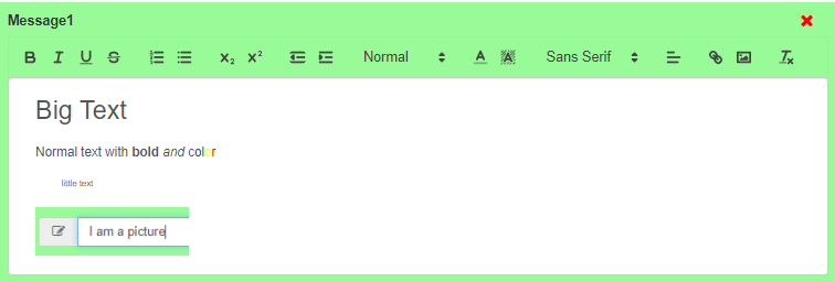
This control allows the form designer to add text or images to the form, whether it is a logo or some descriptive instructions. Messages are made with a rich text editor interface that allows you to format your message with ease. When adding an image, a prompt will appear to enter alt text which will be used for screen readers or if the image fails to load. Advanced users can also choose to turn off rich text, which lets them use raw HTML instead.
This control has the following additional properties:
Designer
Rich Text: Enables the text editor interface to help with message formatting.
Rules
value: A property containing the message content.
Image
The Image control allows designers to add graphic elements to their forms. Images files are uploaded directly. Designers may also add a link to the image, as well as alt text which would be used for screen readers or if the image fails to load. Images have a size slider to adjust the image independent of its control width.
This control has the following unique properties:
Designer
URL: A link used when users click on the image.
Alt Text: Text used for screen readers.
Size: The size of the image relative to the width of the control.
Alignment: Aligns the image to either the left, center, or right.
Image: The Upload brings up the system file explorer to upload an image. Additionally, the Reset button sets the size and alignment back to default.
Barcode
This control generates a scannable image representing some text, a link, or numbers. Several barcode standards are available, and the barcode can be generated with a new value in real time using rules. Barcodes will be added to the file attachments in the submission data and named after its value.
The available formats are: Codabar, CODE-128, CODE-39, EAN-13, EAN-8, EAN-5, EAN-2, ITF-14, MSI, MSI10, MSI11, MSI1010, MSI1110, Pharmacode, QR Code, and UPC. Each format has its own requirements for what a valid value looks like (length, allowed characters, etc.) - consult a reference for the specific standard you select.
Designer
Size/Height: Changes the amount of vertical/horizontal space of the image, depending on the barcode format.
Alignment: The position of the image within the control. The choices are left, center, and right.
Format: The type of barcode standard which will be used to generate the image.
Value: The text retrieved from scanning the barcode. Some barcode standards require the value to be in a specific format.
Hidden Label: Hides the control’s label text.
Rules
value: The text retrieved from scanning the barcode. Some barcode standards require the value to be in a specific format.
Page Break
Page breaks, when enabled, allow users to organize the submission PDF.
All controls below the page break will start on a new page from any controls above it.