Form Designer
Overview
The Form Designer is the tool in which forms are built. It provides you with various form controls, a design area to lay out your form, and access to various form and control properties. It also provides a place for setting up Rules and Actions. Rules are snippets of JavaScript that can manipulate the form at run-time. Actions define what happens with form data when the form is submitted by a user.
This page will cover the basic layout and design of forms.
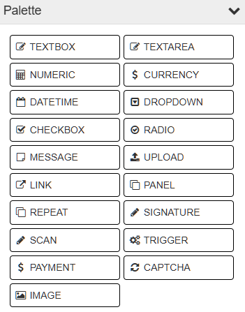
Palette
The palette is displayed to the left and is the toolbox from which you can build from. It contains a drag-and-drop collection of controls that can be added to your forms by dragging them into the design space on the right.
Design Space
The design space where your form is built is on the right. It provides a WYSIWYG (What You See Is What You Get) rendering of the form as it would appear to users, and allows you to rearrange and manipulate the form as needed. Clicking on a control will also cause the properties of that control to be displayed in the lower left.
Note
Whenever you make changes on a form in the designer, those changes are saved immediately. A message next to the title of the form will provide the status of this by displaying either “Saving…” or “Saving complete.”
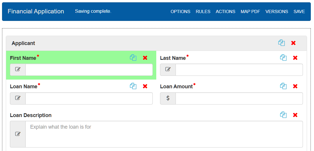
To add controls to your form, drag the control from the palette to a location on the form. A green arrow will show which
direction the control will be dropped. You may also copy controls by clicking the  copy icon
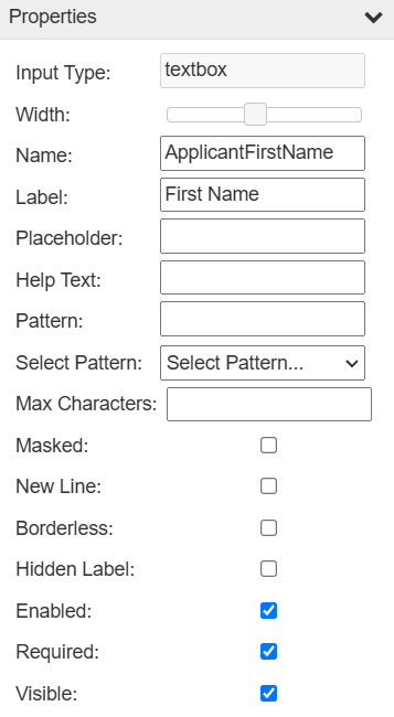
Properties
- The properties of the highlighted control appear in the lower left of the screen. The available properties vary from one type of control to
- another, but they generally allow you to set the name and label of each control on the form, perform resizing, help text, pattern matching,
and to toggle various other options. For specifics on controls and their properties, see Controls.
The following are the most commonly used properties in the form designer:
Width: Resizes the control relative to where it is. For example, setting the slider to half way makes the control half the width of the form.
Name: Unique identifier for a control. Gets automatically set when editing the label.
Label: The visible name for a control. Can be formatted with markup.
Help Text: Adds a question mark bubble which shows text when moused over.
New Line: Places controls on the line below any preceding controls.
Borderless: Removes the outline from controls.
Enabled: When this is checked, users can edit the data inside this control.
Visible: If unchecked, users filling the form will not be able to see this control.
Options
The options menu can be found at the top of the form, and provides the ability to enable or disable certain features on the form.
Connective eSign
Connective eSign allows for forms to be signed with a secure, encrypted digital signature. When submitting a form users will need be redirected to the connective platform for the signature process. Users will also receive a link to their email if they wish to sign later. Once they finish signing they will be emailed a download link of the signed form.
To configure eSign on a form, fill in the fields on the form options. Fields can be filled using form data by putting a field name in curly braces.
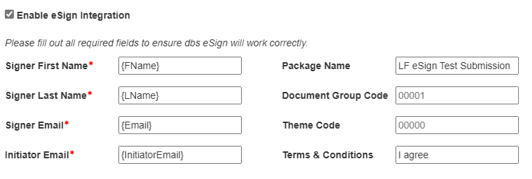
The signer related fields refer to the user filling the form. The Initiator E-mail must be registered to an account on the Connective eSign platform. The Package Name is the label sent to eSign, and will be the name of the final file. The Document Group Code can be used to organize the forms in Connective, and the Theme Code can be used to apply custom designed themes in Connective. Any phrase in the Terms & Conditions field will need to be typed by the signer during the signature process.
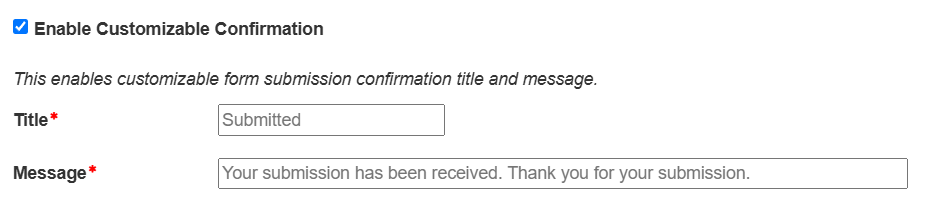
Custom Confirmation Messages
The confirmation message is shown when a user successfully submits a form. Using this option, the title and content of the message can be customized. You may include form data by putting the field name inside curly braces.
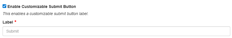
Custom Submit Button
This setting allows you to change the text on the submit button.
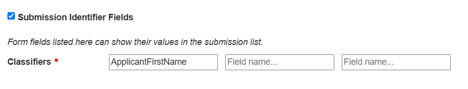
Submission Identifier Fields
Form values can be displayed in the task list by enabling and adding field names in this option. Forms can have up to three classifiers.
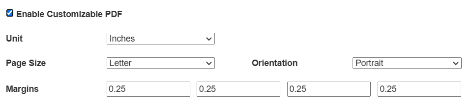
Enable Customizable PDF
The submission PDF’s format can be modified in several ways.
The File Name is the PDF name in the submission and form actions.
Page Scale is a zoom percentage affecting how large the controls appear on the page.
Page Size and orientation modify the dimensions of the overall document.
Margin fields modify the whitespace of the PDF borders.
The Unit dropdown is the type of measurement system used for the margins. There are six header and footer fields, which can be used to add text to the specified locations on the PDF.
The Hidden Form Label check box removes the form’s title bar from the PDF.
By default, Avoid page breaks inside containers is checked, which will make the PDF attempt to keep container (panels, repeats, tabs) contents together on one page.
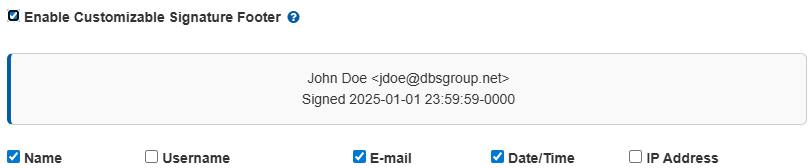
Enable Customizable Signature Footer
These option control what metadata is displayed for completed signatures. The available information includes:
Name
Username
E-mail
Date/Time
IP Address
A preview of the footer is shown above the checkboxes. Name, Username, and E-mail are pulled from the user’s profile and thus are not applicable to form fillers who are not signed in.
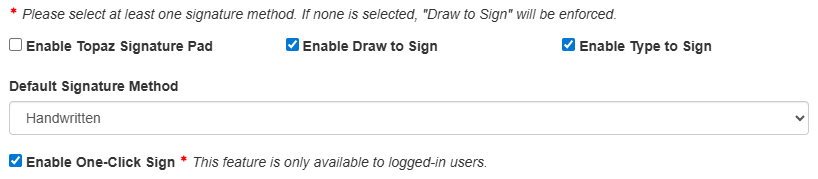
Signature Methods
These checkboxes control which signature methods are available to users filling out the form. Topaz, draw to sign, and type to sign options are available for the signature pop up, and at least one must be selected. With multiple options selected, the designer can choose a default using the dropdown. You may also enable One-Click Sign for logged-in users.
Note
With Topaz signatures, the draw to sign method will be used as a fallback if the Topaz signature pad is not available.
General Form Options
These options modify various general features about the form.
Enable Geolocation: When enabled, the form can collect location data from the user filling it out. Users will be prompted to allow location access, and location data can be accessed using Rules.
Read-only Form: When enabled, this removes the submit button. Useful for creating a report interface.
Unsaved Changes Prompt: When enabled, text at the top of the form informs the user about whether form data has been saved yet.
Save PDF on Submission: When enabled, PDFs will be generated and saved whenever a form is submitted.
Save PDF Created On-Demand: When enabled, recreated PDFs in the submission list will be saved for future viewing.
Preemptive Authentication for HTTP POST Actions: Sends authentication credentials immediately with POST requests, instead of waiting for the server to request them.
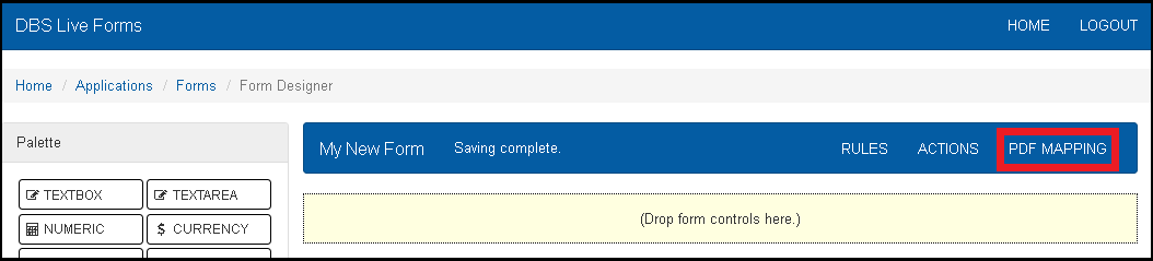
PDF Mapping
Once all the controls on a form are created, it is possible to map the data of those controls onto PDF with text fields. The PDF with the mapped fields is filled in using values from the form and will be used instead of the default generated PDF at submission. To manage the PDF mapping, click “MAP PDF” the top right of the form designer.
If there is no PDF mapped to the form, the initial pop up panel will ask for the PDF the form should map to. This can be selected from the systems file browser. Currently, LiveForms does not support PDFs with embedded scripts. Once a PDF is selected, click “Upload Template” to confirm the selection. The next step is to map the PDF fields to the existing form fields. Each PDF field will have a dropdown used to select a control ID. Once all controls are mapped, click save at the bottom right to complete the mapping. All mapped fields in the form will appear with a blue flag after getting mapped.
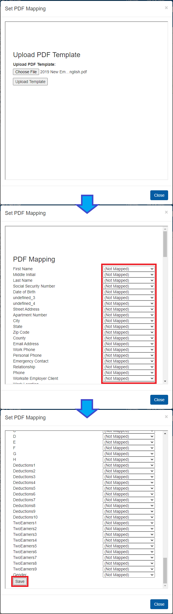
If a PDF has already been mapped to the form, clicking on “MAP PDF” will let you edit the PDF mapping.
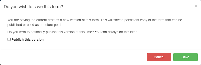
Versioning
Once you have finished designing a form, you may save a version of the form at its current state by clicking Save Version at the top right of the designer interface. In the resulting popup, you may give the version a custom name.
You will also have the option to publish the current version of the form immediately. Published forms may be published as either General Use, or Flow Only.
Click on Save to save the draft and, if applicable, publish the form.
The publication and version name can be modified later through the forms list.
Note
A form will not be accessible until it has been published and given the correct permissions.
Viewing a Saved Version
You may see a preview of the current form or a form version by clicking on Versions in the top toolbar. This brings a popup where you can select which version to view.
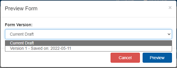
The resulting preview will look and function the same as when someone is filling out the form.